How to Design an MVP That People Actually Use
Most MVPs fail in design before they fail in code. Here's how to design the smallest useful product without shipping a confusing mess.

title: "How to Design an MVP That People Actually Use" author: "Shubhi Goyal" date: "2026-04-13" excerpt: "Most MVPs fail in design before they fail in code. Here's how to design the smallest useful product without shipping a confusing mess." categories:
- Design
- Product
- Startups
Most founders cut too much when they design an MVP, and that is exactly why the product feels broken on day one.
An MVP is not the smallest thing you can ship. It is the smallest thing that still delivers one complete outcome.
That distinction matters more than your color palette, your logo, or whether you use Figma auto layout correctly. If users cannot understand what to do, trust what they see, and finish the main job in under a few minutes, your MVP is underdesigned.
We have seen this pattern repeatedly. Founders usually remove "non-essential" screens, edge states, onboarding cues, and confirmation steps to move faster. What they actually remove is clarity.
Good MVP design is not about making the product look expensive. It is about reducing the number of decisions a new user has to make before they get value.
Start with one user outcome, not a feature list
If your MVP needs a long product spec, you are designing too much. The right starting point is one sentence: what should a first-time user accomplish in their first session?
That sentence should be painfully specific. Not "manage finances" or "automate outreach." It should sound more like "upload a lead list, generate a personalized opener, and approve the first message in under 10 minutes."
That is how we think about MVP scope at bytelabs.
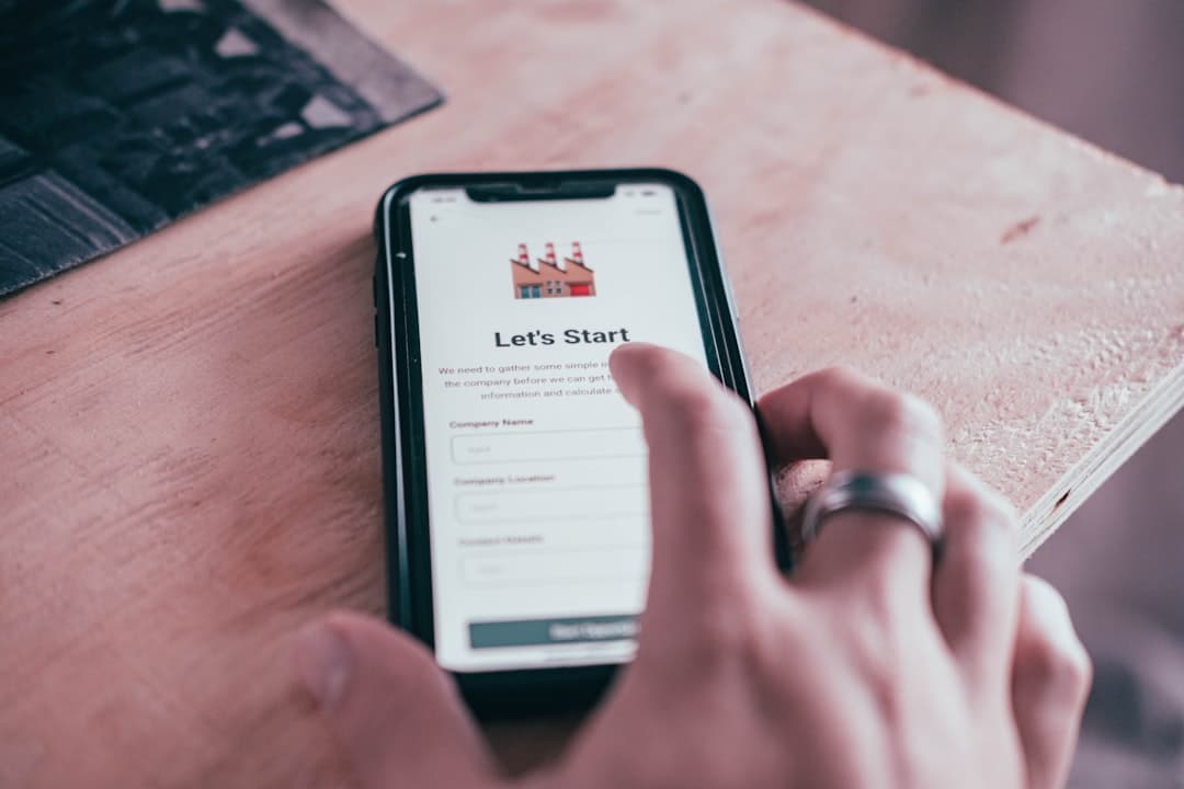
For Utkrusht.ai, the product was not designed around a broad idea like "AI sales automation." It was designed around a narrower first-use outcome:
- A user should connect inputs, generate outreach content, and see AI output stream in real time without wondering whether the app froze.
- We prioritized streaming feedback in the interface because waiting silently for LLM output destroys trust fast, especially in an AI product.
- The frontend used Next.js and the backend used Python FastAPI, but the design decision mattered just as much as the technical one: show progress as the work happens.
That product launched in 4 weeks because the scope was anchored to one complete flow.
Your MVP should usually have only 1 primary flow, 1 supporting flow, and 0 vanity flows.
Here is the filter I would use before designing a single screen:
- Keep the primary flow if it directly produces user value in the first session. If removing it makes the product pointless, it stays.
- Keep a supporting flow if it prevents the main experience from collapsing. Basic onboarding, confirmation, and empty states usually belong here.
- Cut vanity flows if they exist mainly to make the product feel "complete." Profile customization, advanced settings, and deep analytics are common distractions.
A useful benchmark: a founder should be able to explain the MVP user journey in 5 steps or fewer.
If it takes 8 or 10 steps to explain, users will feel that complexity too.
Design the happy path first, then fix the trust gaps
Most MVP wireframes focus too much on screens and not enough on user confidence.
A clean layout is useless if the product creates doubt at every step. New users ask the same questions again and again:
- "What am I supposed to do first?" If the interface does not answer that immediately, your design has already failed.
- "Is this working?" This matters even more in AI products, asynchronous workflows, and anything involving uploads, syncing, or background processing.
- "What happens if I press this?" Ambiguous actions kill conversion because cautious users do nothing.
- "Did I do it right?" Confirmation states are not optional polish. They are part of the product.
One counterintuitive truth: MVPs need more state design than mature products, not less.
That sounds backwards, but it is true because early products have low trust. Users do not know your system yet, so the UI has to explain more. Mature products can lean on habit. MVPs cannot.
When we work on early-stage products, we design these states before visual refinements:
- Empty states come first because most early users will see them. An empty dashboard with no guidance feels like a dead product.
- Loading states come early because speed is partly perception. If something takes 4 seconds but communicates progress clearly, it feels faster than a silent 2-second wait.
- Success states matter because they tell users they completed the task. Without them, users repeat actions or assume failure.
- Error states deserve plain language because generic system messages break trust instantly. Tell users what happened and what they can do next.
For AI products, this matters even more.
On Harmony.ai, the technical challenge was LLM orchestration with tool-calling chains, but the product challenge was helping users follow what the system was doing. We built that platform in 4 weeks, and one of the biggest cost drivers was prompt token count. We reduced that by caching intermediate outputs, but the design lesson was separate: users needed visibility into progress and outputs at each meaningful step, not one giant black-box result at the end.
A simple MVP wireframe checklist looks like this:
- The first screen should tell users what the product does and what action to take next in under 5 seconds.
- Every action button should use a specific label like "Generate first draft" instead of vague text like "Continue."
- Every async action should have a visible in-progress state, especially if it lasts longer than 1 second.
- Every important flow should end with a confirmation state that offers one obvious next action.
If your MVP does not answer those basics, it is not minimal. It is incomplete.
Use a simple design system immediately
You should not design every screen from scratch for an MVP. That is slow, inconsistent, and usually how founders end up with seven button styles by accident.
A tiny design system is enough. You do not need a full component library with 60 tokens and elaborate documentation. You need a few rules that keep the product coherent while the team moves fast.
At bytelabs, the practical version usually looks like this:
- We define 1 primary action style and 1 secondary action style because most MVP confusion comes from unclear hierarchy. If everything looks clickable, nothing feels important.
- We keep typography to 3 levels for early products: page title, section title, and body text. More variation adds visual noise without improving usability.
- We standardize spacing early because messy spacing makes products feel less trustworthy, even when the functionality works.
- We choose a neutral base and one accent color because founders often overuse color to compensate for weak hierarchy. Better layout beats more decoration.
A lightweight token setup is often enough to make the product feel intentional:
:root {
  --bg: #0b0d12;
  --surface: #131722;
  --text: #f5f7fb;
  --muted: #9aa4b2;
  --primary: #4f7cff;
  --radius: 12px;
  --space-1: 8px;
  --space-2: 16px;
  --space-3: 24px;
}
That level of systemization speeds up both design and engineering.
It also reduces rework. Surge is a good example of why clarity beats improvisation. It was a Next.js platform handling thousands of concurrent users with real-time updates over WebSockets. The backend data layer was rebuilt twice, first with Supabase realtime and later with custom Postgres plus Redis pub/sub because Supabase added 200ms+ latency under load. When systems change underneath the product, consistent UI patterns make the experience far easier to maintain.
The same principle applies to MVP design: keep the foundation stable so iteration happens in the right places.
What to design before high-fidelity screens
Do these in order:
- Map the 5-step user journey before touching visual style. Flow mistakes are more expensive than visual mistakes.
- Define the reusable components next so product changes do not force full-screen redesigns every week.
- Design edge states before polishing visuals because real usage exposes state problems faster than aesthetic problems.
- Move to high fidelity only after the structure is stable. Pretty confusion is still confusion.
Cut features aggressively, but do not cut usability
Founders usually ask the wrong MVP question. They ask, "What can we remove?" The better question is, "What must exist for the product to feel reliable on first use?"
That is where better design decisions come from.
For mobile products, this is even more obvious. On Uniffy, we built a cross-platform React Native app in 2 months. React Native was the right choice because the client's team already knew React, and onboarding speed mattered more than the marginal performance gain they might have gotten from Flutter. The product decision behind that technical choice was simple: ship a usable mobile experience faster with a stack the team could actually maintain.
That is how MVP design should work too. Choose the path that gets you to clarity faster.
Here is what I would cut first in almost every MVP:
- I would cut account customization because users do not care until the core value works.
- I would cut dense dashboards because summary metrics are usually not needed before the product has recurring behavior.
- I would cut multi-role complexity unless the product truly cannot function without it. Permissions are expensive in both UX and engineering.
- I would cut advanced filters and sorting until users have enough data to need them.
Here is what I would keep, even in a very lean version:
- I would keep onboarding guidance because blank interfaces convert terribly.
- I would keep clear navigation because even a 5-screen MVP feels confusing without structure.
- I would keep basic trust markers like confirmations, activity feedback, and sensible defaults.
- I would keep one strong empty state per core screen because users hit emptiness before they hit power-user complexity.
A strong MVP design should feel obvious by the second screen.
If users need a demo call to understand your product, the design is carrying too much hidden complexity.
What to Do Next
Open your current MVP file and delete every screen that does not support one complete first-session outcome.
Then tighten the product to this structure:
- One primary user journey with 5 steps or fewer.
- One onboarding moment that explains what to do first.
- One visible loading, success, and error state for each critical action.
- One tiny design system with consistent buttons, text styles, spacing, and colors.
That is enough to design an MVP that feels focused instead of flimsy.
If you are deciding between "shipping faster" and "designing properly," choose proper product clarity every time. The extra day spent designing the right first-use flow usually saves weeks of confusion after launch.
If you're at this stage, schedule a call with us.